March 22, 2007
Spotlight - The Art of Dan Ouellette
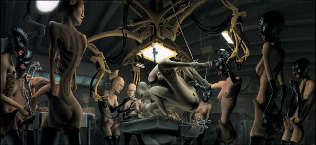
Background: Just a while ago I had the pleasure of receiving a book of erotic cyberpunk fiction by very successful erotic fiction author, M. Christian. By way of thansk, I wrote a post to highlight M. Christian and his book, which gave me the opportunity to conduct a very interesting online interview through the blog. Since then, artist and director, Dan Ouellette sent me a terrific set of prints of his artwork. He’s a frequent commenter here on CPR, and wanted to show his appreciation for the work I’ve put into his site. I really dig him sending me the prints (more than a few of these prints will be hanging in my office once I get them framed). And again, I don’t do any advertising here at CPR (I tend to find ad placements at odds with the whole idea of celebrating cyberpunk), but I’m more than willing to be happily bribed by artists, authors, film makers or musicians who want to show their appreciation to the site by sending me cool stuff like M. Christian and Dan have done. That’s enough of an intro - on to the art of Dan Ouellette!
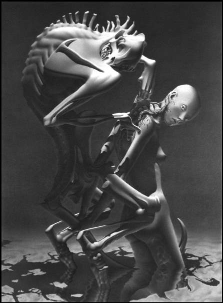
Dan Ouellette Bio: Dan Ouellette is an established artist and production designer in NYC. He has designed many independent feature films, commercials and music videos. As an artist he has exhibited widely. He has been published in numerous anthology art books including Bio-Mannerism which also features work by H.R. Giger and Beksinski, and he has been featured in magazines internationally.
More recently he has branched off into directing as well. His music videos for Android Lust (see “Stained” video above) and The Birthday Massacre have been very favorably received and have aired internationally on TV as well as getting heavy play on websites like Youtube. He has numerous sci-fi and horror projects in development.
Dan’s aesthetic leans heavily toward the biomechanical and psychosexual. He is equally influenced by both mediums, film and fine art, often with elements of both blending into one another. His website is www.neuroticadivine.com.
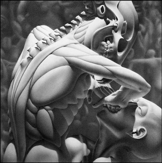
What Others Have Said About Dan’s Work: David Bowie commented while looking at Dan’s art that he has noticed a strong influence of sci-fi on contemporary art… this from The Man Who Fell To Earth! Giger saw a different aspect, saying simply “Very bony.”
Final Thoughts: A number of Dan’s shots are significantly more psychosexual than those chosen here (all images here are obviously copyrighted by Dan Ouellette ). I definitely see a Giger influence in his work. More importantly, his artwork prompts a nice, if somewhat disturbing cyberpunk contemplation. Definitely good stuff! I intend to use the comment feature below to ask Dan questions on his artwork and movie making. PLEASE feel free to join in - if you have questions for Dan on the artwork here or of other shots on his site, please ask!


Comments
March 23, 2007
SFAM said:
Dan, to start off, I was wondering if you could talk about your exposing of the backbones and skulls in your artwork. Visually and thematically, what are you exploring with this?
Neurotica Divine said:
My drawings have always begun with very rough sketches. Forms tend to emerge out of these, bodies tangled. Often I try to capture a moment of tension, erotic or poised. The tension expands as I refine the image and begin grappling with the way it might be perceived by an audience. To extend that tension I’ve often pushed my content into areas where I know people feel less than comfortable. Especially in the US which is so puritanical, our bodies are usually a great source of anxiety and fear. The bone aspects emerged from both the method of deriving the forms initially, the rough sketching, and a refinement of that knowing that this aspect can unnerve.
We’re fine with our skin, the surface quality, but not so comfortable when the inner workings begin to emerge, and even more so when they are strangely deformed. The subtext of this has always fascinated me. How precisely to cross that line with an erotic form turning somewhat monstrous, beauty sliding into ugly.
waxx said:
This is excellent! and I just love Android Lust!
Great video, great art, great article!
SFAM said:
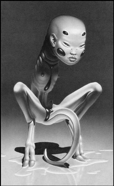
Dan, I really like the thought about exploring the idea that we hide behind our skin. This gives more understanding of your painting, “What little girls are made of?” above. In looking at the Mewler, are the hoofed feet a similar representation? Do these indicate the thought that potentially we see demons within ourselves?
March 24, 2007
Neurotica Divine said:
The Mewler was a reworking of creature design ideas for a Vincenzo Natalie (Cube) project that I was hired on. Once the project got shelved (and I extracted myself and my drawings from a huge legal battle with producer Robert Lantos) I went back and reviewed them again. There is no question I was a bit frustrated with having design concepts dictated to me, especially with regard to sexual anatomy. I altered some of them and came up with this version I’ve drawn full size including adding the hooves. It’s hard for me to recall my exact thinking at the time and whether your “demon” idea was in my head. But I was raised Catholic and there is no doubt that the imagery of Catholicism still muddies my mind’s eye. Again though, I think also the tension aspect is there. The hooves make its stance that much more poised, or maybe even the opposite, more tottery in a way… like a fawn.
In retrospect I think there was also something unconscious about fear of fatherhood in creating this. (I have become a father only recently.)
March 25, 2007
SFAM said:
Ah, fawn or demon - kind of a big swing! But wow, so this was originally for a movie (in modified form)? How much of your artwork is associated with films?I notice you mostly use black and white. What underlies this?
Also, regarding your video, you seem to get some truly cool visuals. Could you talk about your approach to designing the visuals? Android Lust’s “Stained” video looks very polished. Can you talk a bit about the budgets involved?
Neurotica Divine said:
Well you see… fawn or demon… that kind of shows how I like to choose imagery which teeters between extremes!
I started making art when I was in film school. I think much of the lighting, which is rendered in my head usually, comes from studying lighting techniques for film. This is the only instance professionally of the drawings being directly related to a film, although I have many drawings and sketches for my own scripts and film projects, of course.
Pencil lead is unique among tools. The blackest black isn’t ever really black; but in person the drawings have a luminous quality from the lead. Colored pencils use pigment and would not work in the same way to give me the intensity, they tend to look pale no matter what. It’s a rarely used medium… not surprisingly since it takes months for me to get all that lead down so precisely.
I eventually intend to try my hand at oil painting. But with 3D dabbling, filmmaking, drawing, writing and my work as a production designer… I’m a bit swamped.
With the videos, as with my art, I tend to look at what is around that amazes me… stuff which breaks new ground both technically and visually. The Stained video was from a concept for a TV pilot set, a job I was on… some Anne Rice thing that never aired. I knew when I offered it to the director how great it would be… but I also realized she’d never go for it and the DP would scoff at it… (DPs don’t like mirrors.) But I knew I’d return to it one day.
The budgets vary drastically. But they are all very very low budget by music video standards. I’ve used my career in film to swing favors and I’ve done so much film work I know how to cut corners really effectively. I’ve always felt my design experience would give me an edge once I started directing… design is so rarely utilized with any vision by directors… it’s mostly just considered a background. There is a misconception among producers that art department stuff costs too much money… this in combination with the fact that art crews always get shafted on rates compared to camera crews… kind of determines that most shooting is camera-centric. In the big budget world designers go grossly overbudget as a rule (I’ve often thought this was a big fuck you for all the years of kissing camera’s ass) and as a result the design = $ myth continues to be perpetuated.
But any look at an Eraserhead or Tetsuo movie will give you pause.
March 26, 2007
nashed said:
this is a very good concept id loved it so much
SFAM said:
Neurotica Divine Says: “In the big budget world designers go grossly overbudget as a rule (I’ve often thought this was a big fuck you for all the years of kissing camera’s ass) and as a result the design = $ myth continues to be perpetuated.”
I would love to explore this idea more. On some large scale productions, the budget clearly shows (whether it contributes to a better movie is a different question), while on others, you spend your time wondering where all the F’ing money went (Waterworld, anyone?). In designing to small budgets, what’s the process you use to stay creative? Does your mind still wander free from a designer’s perspective, whereupon later you look at ways to making your vision come true, or do you do the opposite - do you “see what’s in the cupboard” and then make your vision from that? Based on your response on the Stained video, you seem to be doing the later - meaning you found a cool set and then decided to try to make something from it.
Regarding the comment that design is rarely used, do you mean that often you see very little effort spent on designing interesting sets? It seems that with most low budget scifi pictures, the set designs have more to do with site selection, than in making any real modifications. It’s a rare movie like Hellevator: The Bottled Fools, where there was obviously detailed work done on set design. Is this what you’re referring to?
Neurotica Divine said:
How to best describe wasteful thinking? It’s difficult.
It isn’t that the money determines anything per se… but mucho money does often bog itself down easily. I’m a practical person. If a director can see a vision involving design, than he/she can adapt the shooting and the schedule to best serve that vision. Any adaptation, coordination, vision… usually leads to clarity and saving money. Unfortunately laziness predominates. Director’s rarely need to even vaguely understand how things are made or done anymore. But removing them from the process… allows for all kinds of miscommunication, confusion and waste.
Designing on a budget doesn’t mean not spending. It means coordinating vision with budget to maximize effect, like Lynch did in Eraserhead. Many directors won’t get their hands dirty with any of that… they are above it. Some don’t know enough about what design actually IS in a film to really get involved in a nitty gritty way. Instead they spend all their energy and often their resources on cool camera gadgetry. Here’s a good example: Ridley Scott was an art director before he started directing. I don’t know… you think it shows at all in Alien and Blade Runner?!
So, no matter what budget you have to work with… it is only effective if it is adapted into the overall project efficiently… and ideally that is done by a director who can make demands that may seem spurious to other departments.
When I say design is rarely used… I don’t mean big sets being built specifically. Design can be very small and very effective at the same time. Big sets and huge design concepts can also be a total waste if not “rendered” effectively by a skilled director.
For me I usually look at a budget as nothing more than a reality. Most director’s hate being told there isn’t enough money for this or that, which I think is kind of lazy on their part. The reality is there only IS so much money and instead of seeing this as a limit to their creative possibilities… why not, well… I dunno, BE creative! It’s harder, no doubt. But it can also force a director to stop being lazy with his/her vision and start deciding what he/she is actually making.
I can’t tell you how much money I’ve wasted on sets with four walls… that you only see two of in the end… because the director refuses “to be limited” which is the venacular for laziness!
Since I am the director and designer… with my projects, the two aspects are very well aligned and the money is very well spent as a result.
Neurotica Divine said:
A footnote:
Without knowing how to intergrate design into filmmaking, stupid directors think that spending more money will make more spectacular and therefore effective sets.
I should also add that Kubrick’s films offer another good example. Many many times his sets designed his shots… how often do you think that happens in hollywood?
March 27, 2007
SFAM said:
The “sets design his shots” comment is an interesting insight. As is the notion that the directors wouldn’t be intimately involved in something as basic and important as set design. I guess on larger scale productions this can get specialized to the point that the teams don’t interact like they probably should. But is it laziness or simply they are still overwhelmed with all the other aspects of film making? Or said another way, is it that they just aren’t prepared to the point they probably would want to be in the other aspects of film making to take the extra time needed on the design aspects?
Also, you’ve done a number of videos and are now looking at getting into larger films. What do you see as the major challenges from a personal standpoint to making this leap?
Neurotica Divine said:
Obviously it is a sweeping generalization to suggest that many directors don’t know their craft. Let me try to clarify. The machinery of making a film is rather daunting. It is also rather awesome; it isn’t difficult to sit back and watch. The component parts as divided into departments are designed to mostly run by themselves. The crews are a very regimented work force. For many of them, their days consist of simplifying their already mechanized skills. I’ve often found that the parts run the machine. But if the parts claim technical superiority over the driver, it is very hard to reorganize the parts in a way that may increase efficiency, that is… make a better end result.
Individually, those departments may feel they are as efficient as humanly possible but instead they may be contributing to making movies routine. It is not that the director’s laziness shows by not knowing every detail of the film machine, but instead laziness may reveal itself by allowing those parts dictate end results by rote. It takes a very effective diplomat supported by an inate sense of what’s important in any of the myriad details of a production to steer that machine. In many instances, it is simply the job of navigating through the land mines of the egoism of technical superiority.
And, don’t fool yourself… many many movies are made by directors who just show up and know that their big name actors CAN act, their DPs CAN make a shot beautiful, and their designers CAN deliver an awesome set. And while I know that singing Kubrick’s praises may be rather pedestrian of me, how many directors would rebuild a Mitchell camera with a Nasa lens to shoot in actual candlelight? How many would decide that the standard rear projection technology used by the industry was insufficient and should instead be replaced with an undeveloped front screen projection?
The major challenge that I face me is and has been for years… raising capital. Bit boring, I know. I’ve been plying my scripts for years to all the producers I’ve met along the way; also art collectors, gallery dealers… anyone I feel might invest in a film. It is possible that staying in NYC has been a mistake in terms of finding investment but I hate LA. Without having any rich relatives, and not being able to generate enough capital beyond my living expenses to suit my visually complex scripts, I’ve been a bit mired in angling for investment. My scripts have gone from rather large production concepts (a few mil) to smaller and smaller (a few 100,000)… in an attempt to get one off the ground.
Creatively I feel I’ve been ready to do a feature film for a while now. But sometimes I like to imagine that this long wait has actually been a good thing and maybe being forced to be patient is some kind of lesson I needed to learn!
March 28, 2007
SFAM said:
Hi Neurotica Divine, the raising capital issue seems to be the common one for most folks. The most creative seem to be able to get by without much capital (Cl.One would be my most recent incredible example of this - I will be reviewing it this week), but this is often a very hard thing to swing, and involves lots of free time devoted to the project.
Best of luck to you in getting one off the ground - especially a cyberpunk one! If you do, I’ll be glad to help hype it for you as it gets close to release time.
Kaikara said:
Have you ever seen any of Tsutomi Nihei’s works, his most famous being BLAME! Your cyborg artwork reminds me very much of the Silicon Life or the standard Safeguards from the aforemented manga.
Anyone who hasn’t read BLAME! should seriously consider doing so it is probably the pinacle of cyberpunk manga/comics (well on par with Shirow’s works ). For anyone interested, you can find some of the artwork in the manga here:
http://www.cyberiacafe.ch/Tsutomu/Blame/Galerie1_e.html